Improving the Production Management tool

Launched: April 2022
Background
Producer Dashboard (we will refer it as “Dashboard” from here on out), a Tagboard product, is a cloud-based production management tool for organizing and tracking the status of different productions.
It helps manage and launch social media content or live productions for a wide range of broadcasters.
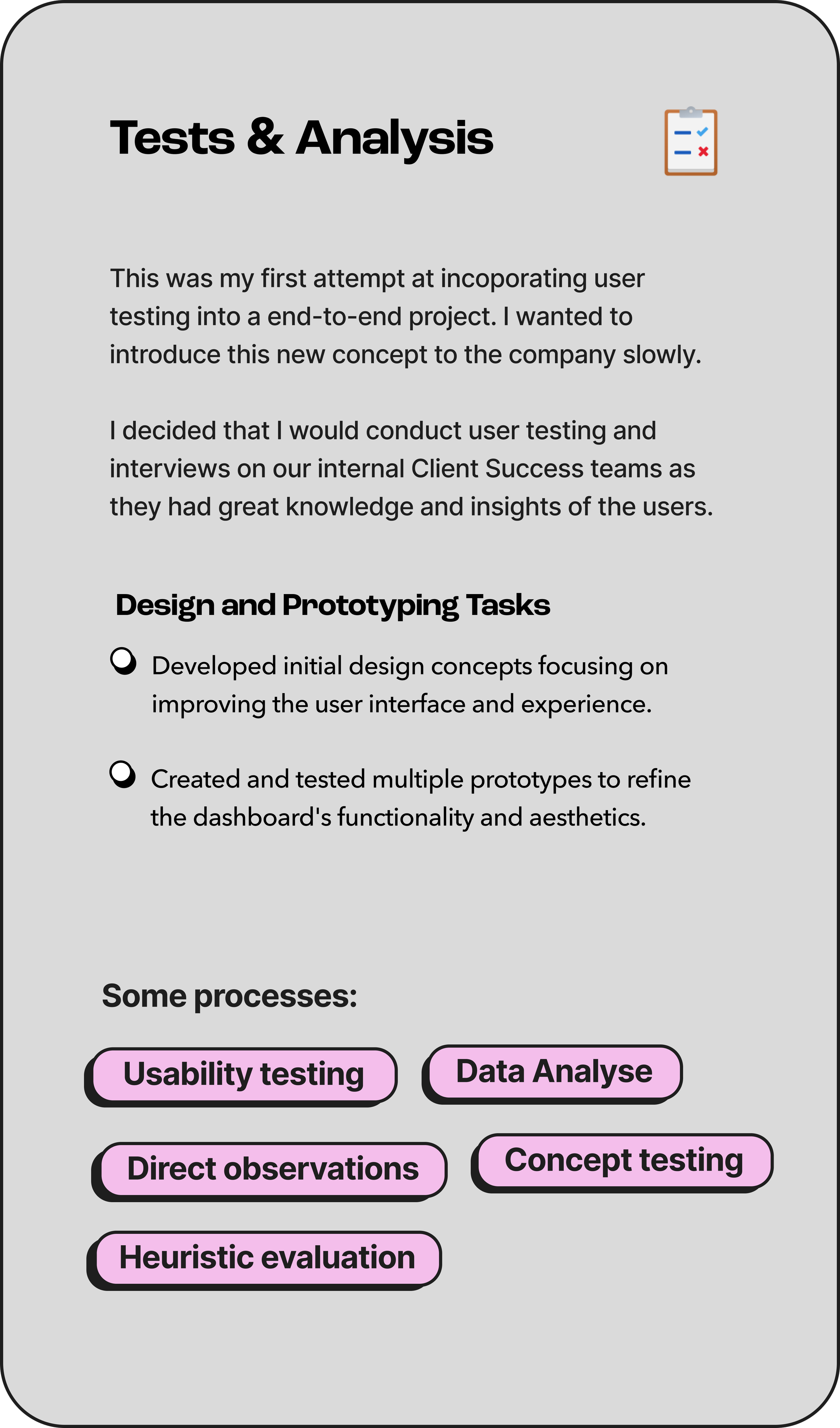
My Role
As the sole Product Designer at Tagboard, I led the end-to-end redesign of our Dashboard which included, but not limited to:
Conduct user interviews and research to inform my decision and direction.
Led weekly design review and critiques to solicit and receive feedback.
Held weekly 1:1’s with PM to discuss feature planning, research, and implementation.
Problem:
In today's fast-paced digital environment, businesses require intuitive and efficient management tools to streamline operations and enhance productivity.
The existing dashboard for managing customer data in Producer was cluttered and inefficient, leading to prolonged task completion times and user frustration.
Goal:
Our goal was to redesign the dashboard to improve usability, reduce operational time, and enhance user satisfaction, thereby supporting Tagboard’s commitment to delivering exceptional user experiences and increasing overall system adoption.
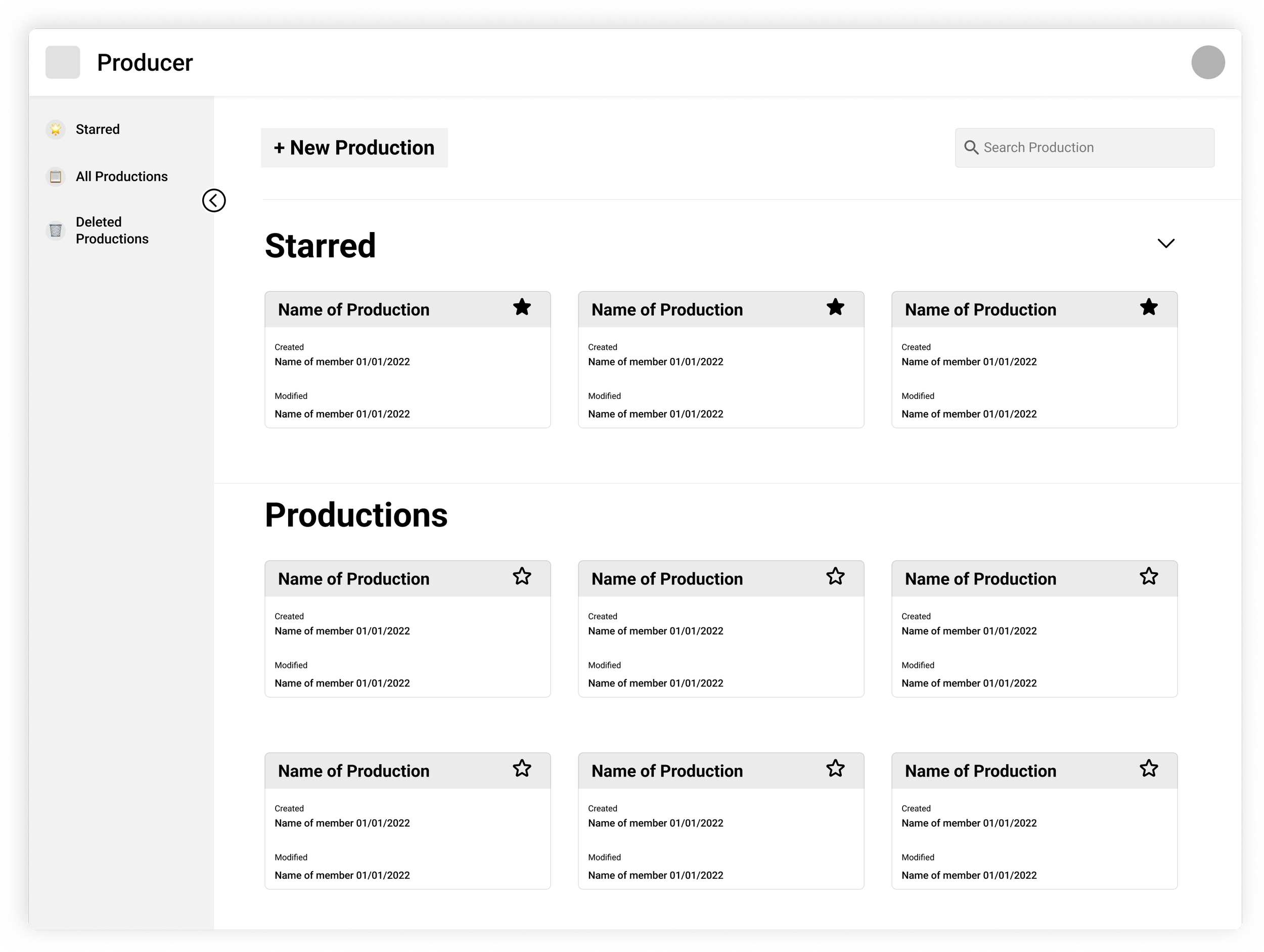
Original Producer Dashboard
Discovery + Audit

The original Dashboard was too minimalistic, lacking important necessary information users craved, and as a result did not support efficiency and proper production creation and management.
Please read: Color scheeme does not reflect 100% of the original dashboard
User Pain Points
From our research, we found 3 key issues with the product that affected the efficiency and overall workflow of our users. The direction of the redesign was a project aimed at enhancing the user experience and operational efficiency for producers.
Issues our users had with our current dashboard:
1. Difficulty Finding Productions
• Over 75% of our users used CTRL+F to find a production. A heartbreak, truly.
• Many users had “Untitled” productions.
2. Creating For The Wrong Teams
• Users failed to select appropriate team accounts before creating a production.
• Users had to contact a member of our Client Success team to help find a production.
• After creating a new production, users left their productions untitled.
3. Inadequate display of information
• Users frequently selected the incorrect production due to a lack of sufficient information.
• There was poor knowledge of production ownership making it difficult to make edits.
Understanding the users
During this initial discovery phases, we began to formulate questions around their needs and concerns to help us craft the best solutions.
Problem Statements
1. How might we help our users find a specific production within a long list?
2. If users do not know or remember their production name, what other information could they use?
3. How can we decrease user error and keep them from creating productions in the wrong team?
4. Why are users not naming their productions, and how might we highlight the value of proper naming?
Ideation time!
Mid-Fidelity
To test assumptions I created mid-fi wireframes in order to test the prototype and user interface design.


These mockups were slightly adjusted to respect confidential visuals and information. Have no fear, lo-fidelity mockups were created but unable to share.
“ JZ, where the heckin is the research you mentioned??”
You’re probably asking yourself,
Sorry, friends
•
•
•
Research and analysis under NDA ••
Research and analysis under NDA ••
I can, however, share…
My research and testing methodologies used for this project:
Moderated discussions with a group of Client Success Managers to gather diverse perspectives on a topic.
Analytics Tools: Gathered data from Heap to analyze user behavior, such as user paths.
Usability testing
Moderated Usability Testing: Conducted with a moderator present to guide the session and ask questions.
Unmoderated Usability Testing: Users completed tasks on their own, using Zoom to record their interactions and responses.
Prototype Testing: from lo-fidelity to high-fidelity interactive prototype testing to validate concepts and iterate on designs before full development begins.
Who I interviewed and tested on:
During this phase, I interviewed five people, specifically those who loosely fit our personas, our Client Success Managers, and our exact personas, external clients.

Here’s The Shipped Redesign!

Dashboard Redesign
The new dashboard featuring filtering capabilities that showcases important information for better management.
✨ New Product Features ✨
I aimed to make the new dashboard user-centric, card-based interface to allow for easier access to key production details and quick navigation through sorting and filtering.
As a reminder, the user pain points were centered around finding productions, creating productions in the wrong teams, unsure of production ownership.
We solved the previous issues by:
1. Improving Organization
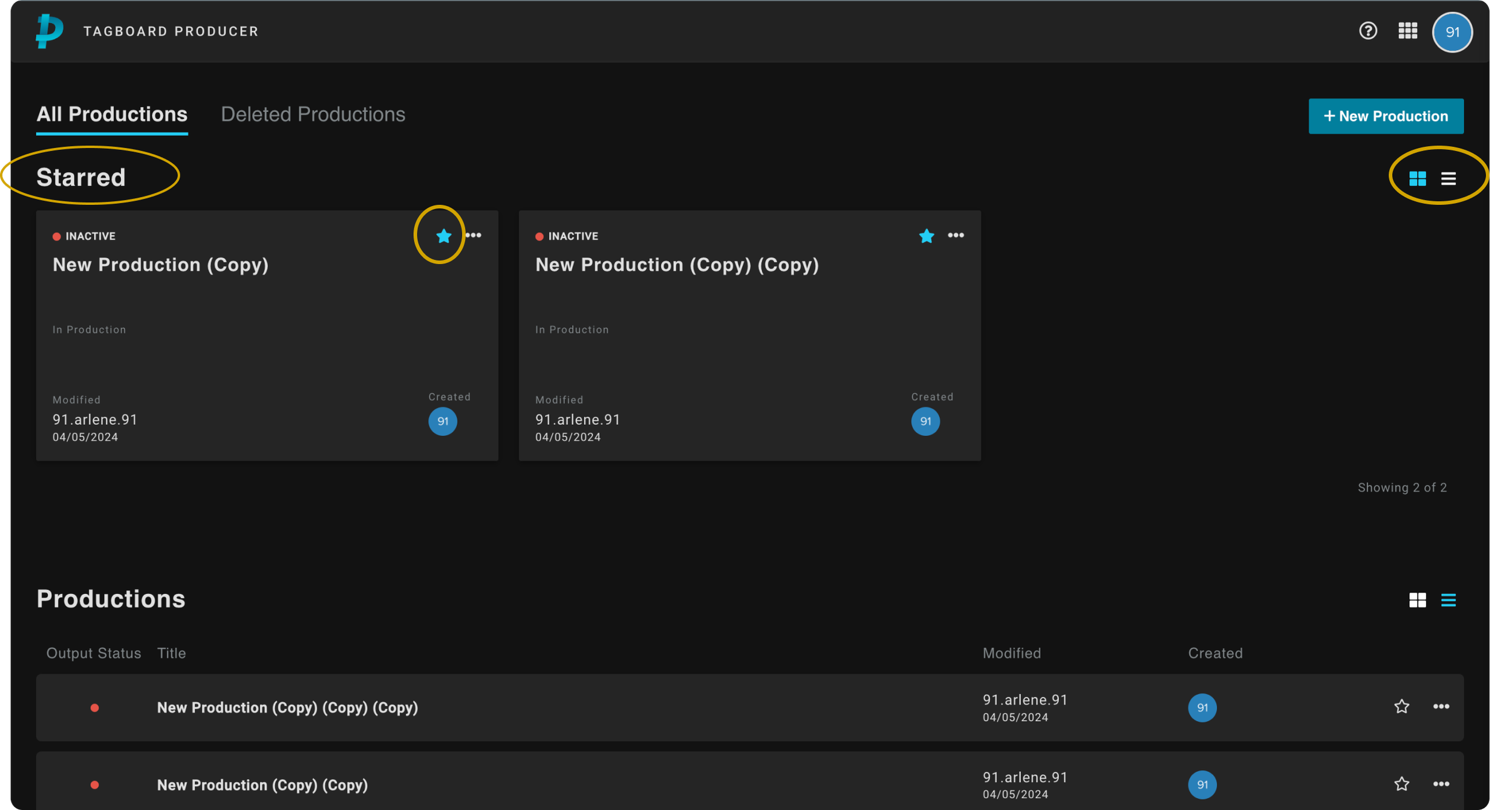
• Changing layout to a grid, allowed for easier visual scanning.
• Introduced double-click functionality to enter production
• Introduced a Starred section to help users quickly access their important or frequently used productions.
• Option to show list view or card view for personal preferences and visual organization
2. Streamlining Production Creation

• Adding a modal to the workflow prompting user to add a name for the new production.
• If users do not belong to a team, remove option
• The option to "Add to Starred" directly within the creation process
• A tag feature for categorizing the production to facilitate searching and organization.
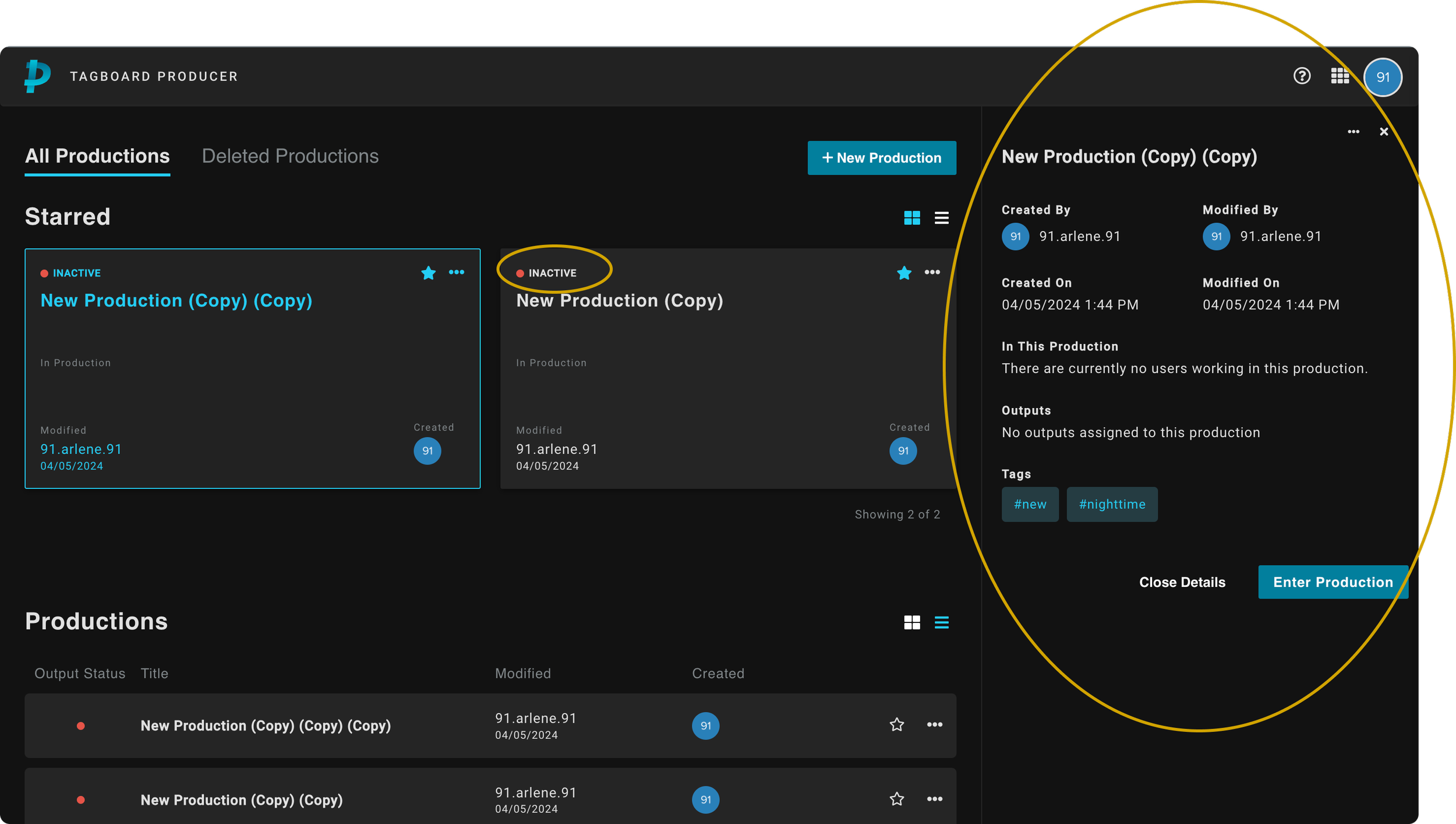
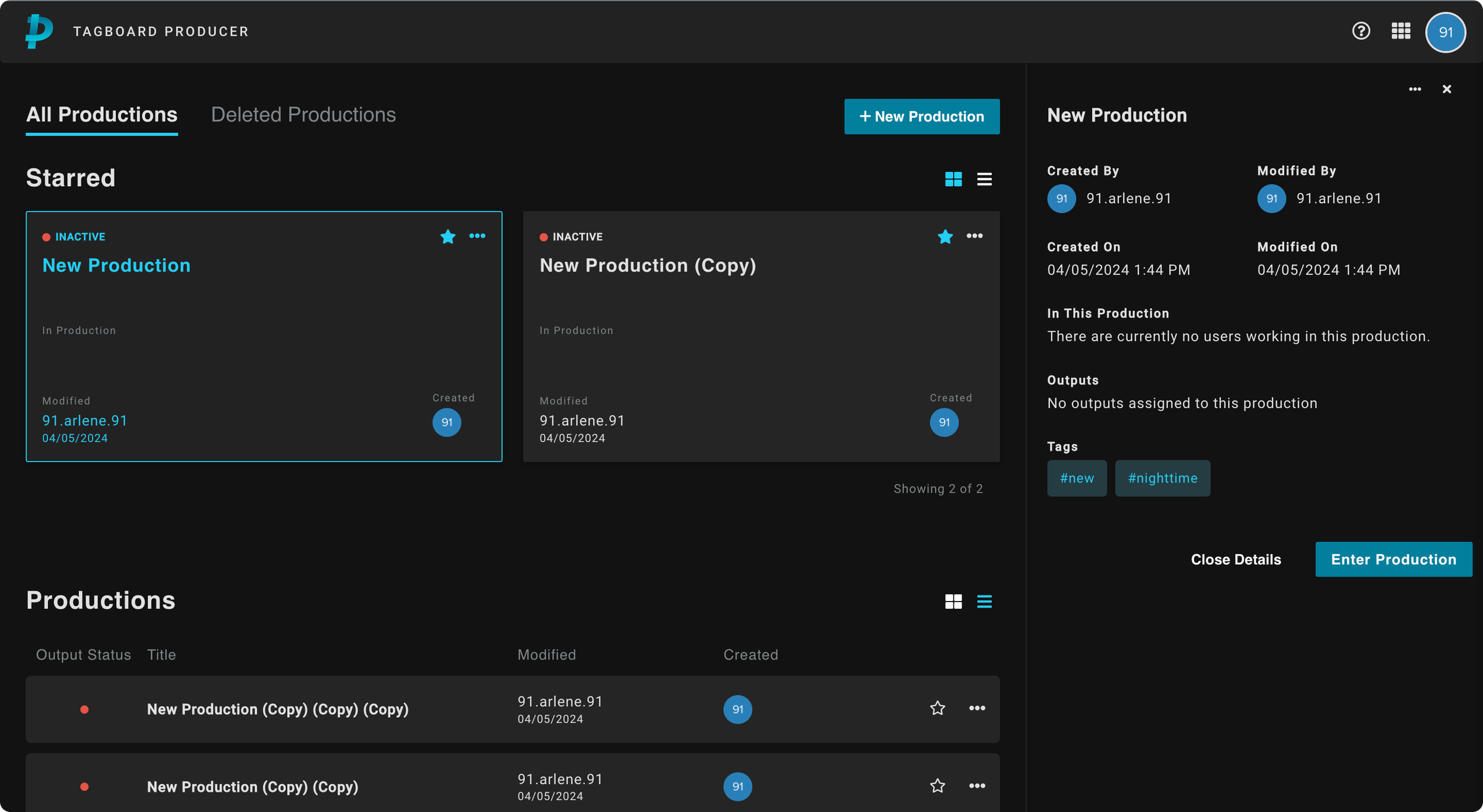
3. Enhancing Information Display
• Upon single click: A right panel opens to display important meta data for each item to help with creation and edit history.
•Output status to let users know which production is “Live” and “On-Air” so they do not enter during air time.
• A view in to who is working inside a production.
4. Improving Production Management

• Option to delete productions to keep unused or old productions out of view.
•Restore feature with 30 day notice for accidental deletions and better management

Before
After
Impact post release
95%
Rise in users generating unique and specific production names
3x
Increase in production discovery speed
Challenges and final thoughts
-
Due to the timeline of the project, we were unable to add a search engine to the MVP. Although starring productions helped sort important productions, it does not help when there is a long list of productions. Search would’ve been a complete net new feature that require extensive research that time did not allow.
-
Introducing a new workflow in the dashboard showed to be unsuccessful. If I had the time, I would’ve conducted user testing to validate our assumption that tagging would be widely used. Without a search feature, it served little to no purpose to users.
-
If I were to have done this project over I would’ve prioritized a search function over adding a tagging feature for the Dashboard. In retrospect, it makes sense why adding a search over a tagging feauture would be beneficial; it is a workflow users were already accustomed to. In contrast, tagging a production was a new feature, so users naturally didn’t seem convinced by it.
My Design Process and Approach


Learnings
Communication and Collaboration
Implementing a new Design Process
During the project, I introduced and championed a new design process that was previously unfamiliar to my team and company.
This approach emphasized early and iterative collaboration between designers, developers, and stakeholders to ensure alignment and buy-in. Key to this process was fostering an environment of open communication at all stages of design and development, and break down silos.
This experience taught me:
The importance of clear communication both a-synchronous and synchronous
Adaptability
The role of empathy in driving organizational change,