Google Sheets Integration
Completed: April 2023
*This case study includes videos and is best to be viewed on desktop
Background
Tagboard's Graphic Editor is designed to assist storytellers in the sports, news, and entertainment industries in producing engaging content, one of many ways being with live data.
However, users had to manually import live data into their graphics, a process that could be time-consuming and prone to errors.
My Role
I led the design process in close collaboration with front-end and back-end engineer team to understand the complexities and capabilities of Google’s API. I also conducted user research and usability testing to validate design decisions and business needs, and to inform future design iterations.
This project could not have been possible without the engineering team, Lance Harper, Justin Brumley, Griffin Hammer, and Product Manager, Jenny Yang.
Understanding the bigger picture
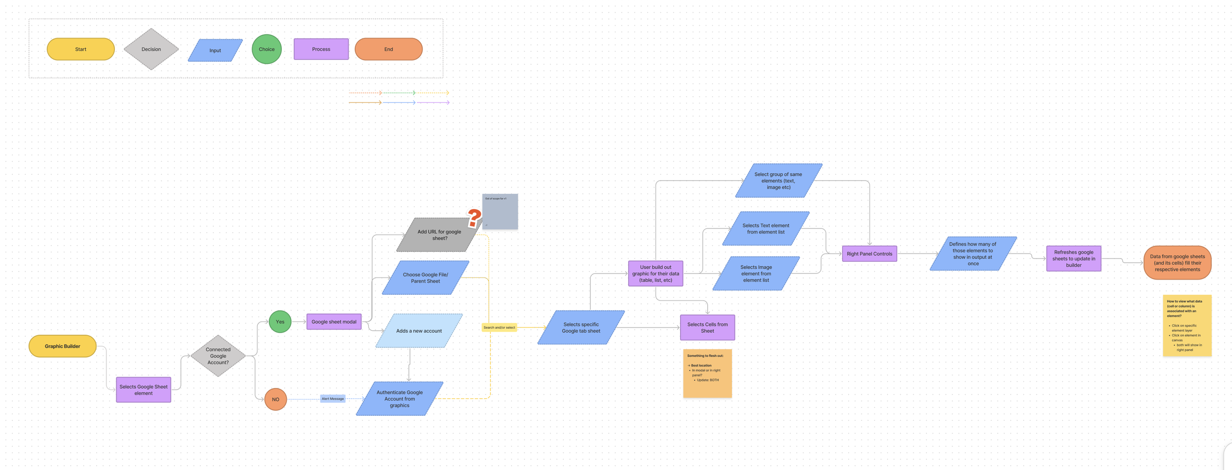
After several discussions with our back-end engineer, I was able to grasp a high level understanding of what we were capable of building. However, I wanted to understand the bigger picture of how users would interact with this integration from a front-end perspective.
By creating a high level user flow, I gained a better idea of the main features that needed to be delivered for the MVP, and discovered area’s that needed better understanding.
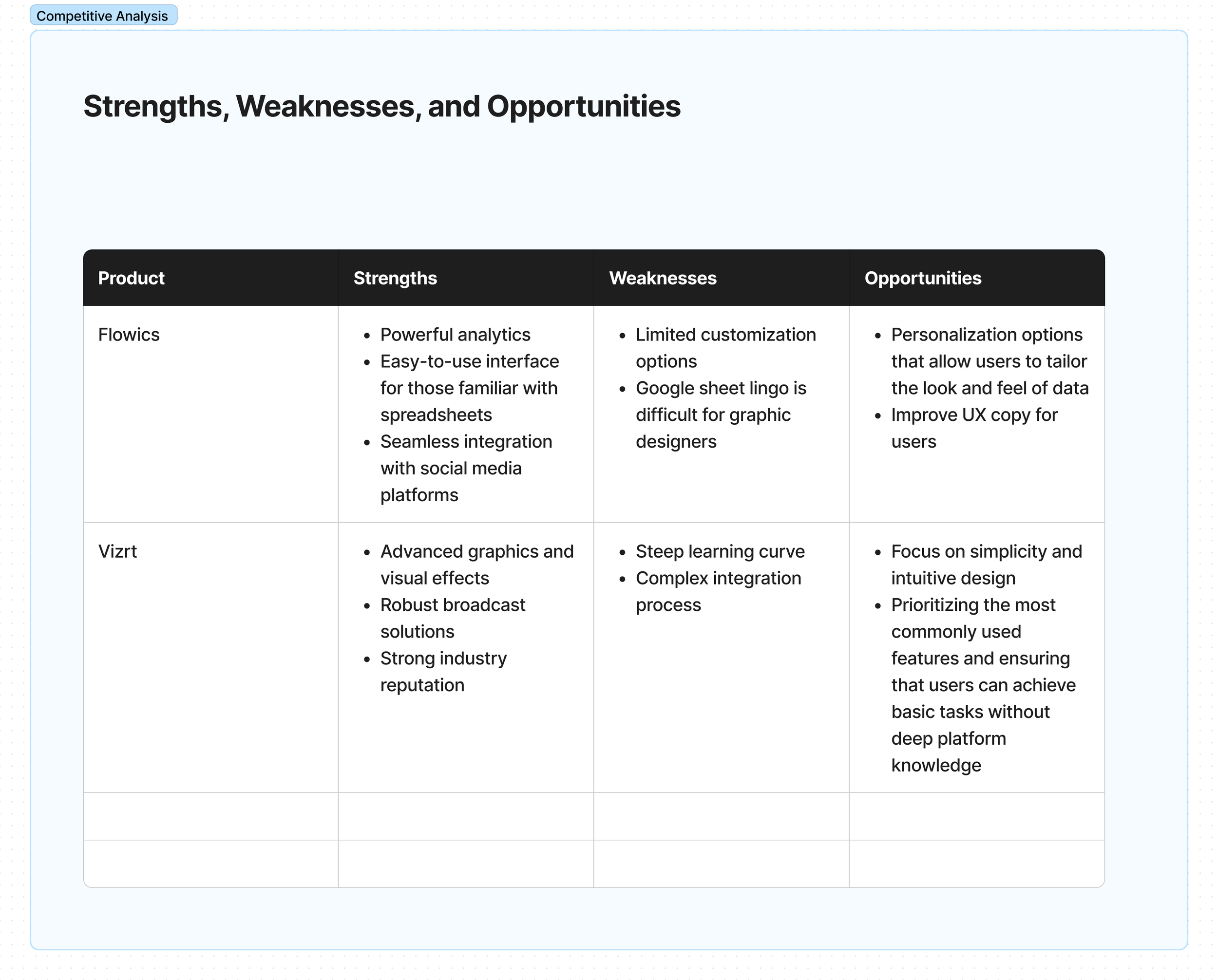
Competitive Analysis
In addition, I conducted a concise competitive analysis focusing on data integration in graphic editors in order to get an insight into the common practice and identify strengths and weaknesses.
Product Features
After understanding the basic initial flow, I conducted user interviews. This added a new level of understanding to the essential needs for a workflow. This allowed us to uncovered a few important product features that would add to the success of the integration.
It was crucial to include/have:
Versatile Data Integration
Integrate private and public Google Sheets options for flexibility, security, and user engagement in content creation.
Auto-Synchronization
Auto-sync between Google Sheets and Tagboard graphics and especially Producer (not included in case study).
Auto-sync should work seamlessly in the background without needing to constantly check or refresh their data sources.
Mapping and Editing Data
Ability to edit and map data within Tagboard’s Graphic Editor
Functional workflow when selecting data points
Ability to map data to specific elements but also adjusting the format, appearance, and behavior of data within the canvas.
Mockups
Backed by research and user insights, the next steps involved transitioning from the planning and analysis phase into design, development, and validation phases.
Here, is where I worked closely with our Sr. Front-end engineer and Sr. Back-end engineer to solve for such problems:
1.Simplification of Complex Workflows
Designers should be able to see the data and be confident in their selection.
Solutions:
• Display all data information pertaining to the google sheet cells upfront instead of listing columns. Users wanted to known what type of data they were going to bring to their graphic before it made it in to the canvas.
• Add option to import data straight into the canvas and Tagboard defines the element (text or image). Additionally, give them the option to choose to add a text or image to the canvas first, and then map data to the element.
A closer look at the modal when users have connected a Sheet and are selecting specific data points and being mapped to a specific element ie. text, shape, image etc.
An alternative workflow. Adding a text element to the grouped layer first, then connecting a data point to add to the canvas.
2. Democratize Data-Driven Content Creation
We learned that the word “data” scared off a lot of non-tech savvy people. The integration, although exciting came with many assumption of steep learning curves.
Solutions:
• User data lingo judiciously as it might confused users. Word’s like “pagination” was not part of our users’ daily language. We had to instead tap into how they speak and read such information- we replaced “pagination” with “current page”.
• Once data is on canvas, display formatting options and automatically display the data as it is displayed in Google Sheets
• When making changes, reduce usage of modals so their workflow is not interrupted
A closer look at the editor’s right panel that allows users to filter the data points within a column, change layout, and adjust spacing between each data point on the canvas.
A third workflow. User can edit existing data points that are on the canvas using the right panel. A list of all the data columns from the previously connected sheet will appear in a dropdown.
Insights
Refining Success Through Feedback and Testing
The success of this project can be attributed to the continuous design critiques, extensive user testing, and the implementation of feedback loops I had been advocating during my time at Tagboard.
These critical components ensured that every design decision was scrutinized and refined, user experiences were rigorously validated, and the product evolved in close alignment with user needs and expectations. With this approach, we fostered a dynamic, user-focused development environment, allowing us to iteratively enhance the product based on real-world usage and feedback, ultimately leading to a more intuitive, effective, and user-approved integration.


