Engage & Delight
Launched 2024
Boosting Product Adoption Through Dashboard Micro-Interactions
*Due to Non-Disclosure Agreements, specific details and visuals from this project are omitted to maintain confidentiality.
Business Goals
Tagboard’s dashboard was getting a total redesign - a facelift, if you will. We needed a way to drive people to our second product, Producer because majority of users we’re not utilizing our cloud-based production software for their shows.
My golden idea:
Let’s Boost engagement and adoption from the home dashboard for existing users and driving engagement for new ones with fun and seamless interactions, without disrupting their workflow of course!
Idea: Bring in micro-interactions into the experience, something Tagboard was not (yet) known for + change the placement of the button.
My Role
Collaboration and Leadership: Collaborate closely with PM’s and engineers to ensure that the micro-interactions are feasible and align with overall product goals. My leadership was crucial in guiding the team through the design process and decision-making.
Testing and Refinement: Unfortunately due to time constraint, no research was done. More of that in “Reflection” section.
Implementation Oversight: Oversaw the implementation of these interactions, working closely with engineers to ensure that the designs are executed as intended and are well-integrated into the product's interface.
Previous CTA placement
If it’s hidden, it doesn’t exist
Current design interaction
Majority of users we’re not accessing Producer through this menu, they were typing out the URL. But for new users, how can we introduce this powerful product into their new workflow?
Let’s ‘unhide’ it then?
No, that is not enough to make this practical and user friendly. Fitts’s Law describes the relationship between the size of a target, its distance, and the time it takes to reach it.

If we simply took out the button, most user activity happens on the left side of the dashboard, where users quickly navigate across pages to work. We still are asking users to move across the screen.
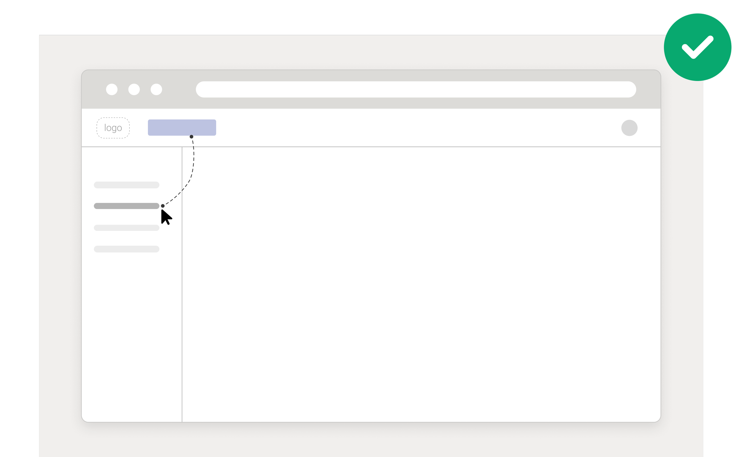
Let’s make it larger, and move it closer to where their cursors is usually found, to increase user engagement and visibility.
Micro-interaction Research
My design direction was simple: let’s utilize our brand colors in the CTA
Products that are killing the interaction and gradient game.

Orbit
Axiome
Assessing current designs
To keep things as simple as possible, I wanted to choose an existing button design as the base of the interactions.

Primary: Driving users to Producer was not the main purpose of the dashboard. This was not the appropriate button to choose from.
The secondary button was calling more attention that I was looking for the new placement of the button.
I found the tertiary button to be the perfect button to play around with its different states.
Don Norman in The Design of Everyday Things.
“ Experience is critical, for it determines how fondly people remember their interactions.”
Ideation - having fun in Figma
The new dashboard would encompass the brand colors. I began ideating on fun new ways to bring all 3 colors to the main CTA to drive users to Producer.

Best viewed on desktop
If on desktop, go head and hover! The gradient of brand color moves around CTA border.
My idea to bring a gradient to the main CTA was born from the idea that all Tagboard products can be used together seamlessly. Together, they created a beautiful and natural workflow, much like a gradient.
If on desktop, hover here as well! The gradient glow follows your cursor.
My approach here was similar as before but controlled by the user, they choose their flow inside Tagboard. Where their journey begin and where they end inside the dashboard is up to the user.
Final Product
Launched 2024
*To comply with my non-disclosure agreement, colors have been changed and the dashboard has been cropped from view.
It didn’t end there!
I always have more up my sleeve: In my efforts to bring more interaction design to Tagboard, I proposed smaller interactions. I wanted to bring fun and awareness to user actions.
Utilizing the 4 main parts of micro-interactions, as described in Dan Saffer:
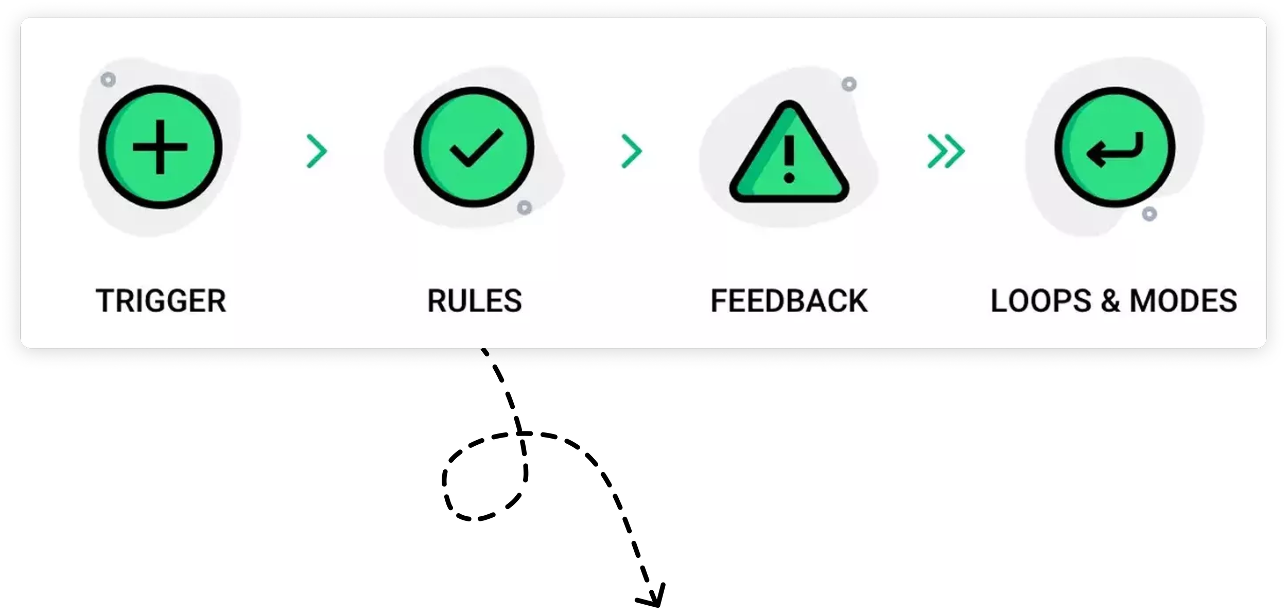
image from Userpilot
I crafted
More
✨ Sparkles ✨
Reflection
Looking back and if I had more time…
My last project was at Tagboard, focusing on an area of UX I am truly passionate about.
I rapidly enhanced my skills in micro-interactions within Figma, largely thanks to the vibrant community support.
The project was proposed very last minute, leaving no time for thorough research.
If I had more time, I would conduct extensive user testing to validate and refine the micro-interactions. I would employ methodologies such as A/B testing to compare different interaction designs and usability testing to observe how users interact with the interface in real-time.
The product has recently gone live, and the team is still in the process of gathering user insights.