Project Untaboo Mobile App

Timeline
6 weeks
UX/UI Designer
Design Role
Designing a mobile app to provide individuals the convenience and security of period care with the help of their growing community.
Team Objective: Design the first iteration of UX deliverables
The Challenge
Despite the widespread need for accessible period care, busy travelers often struggle to find reliable, convenient products while on the move.

The Solution
Focus on maximizing user convenience and support, enabling users to effortlessly request products from those nearby. This strategic use of pre-existing mockups and insights allowed us to efficiently address user needs, paving the way for a user-centric MVP that leverages the power of community and accessibility.
Pain Points & Solutions
We utilized the user feedback gathered from the previous UX Designer to guide our visual direction and iterate on informational architecture.
Pain Point
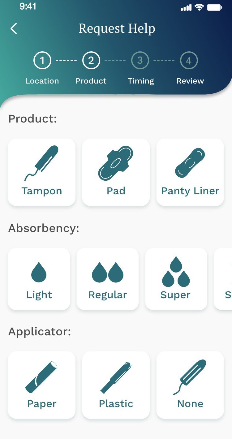
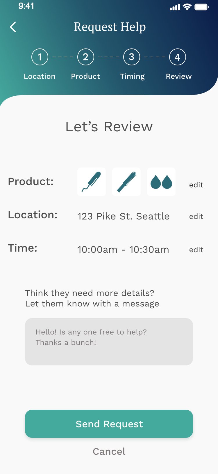
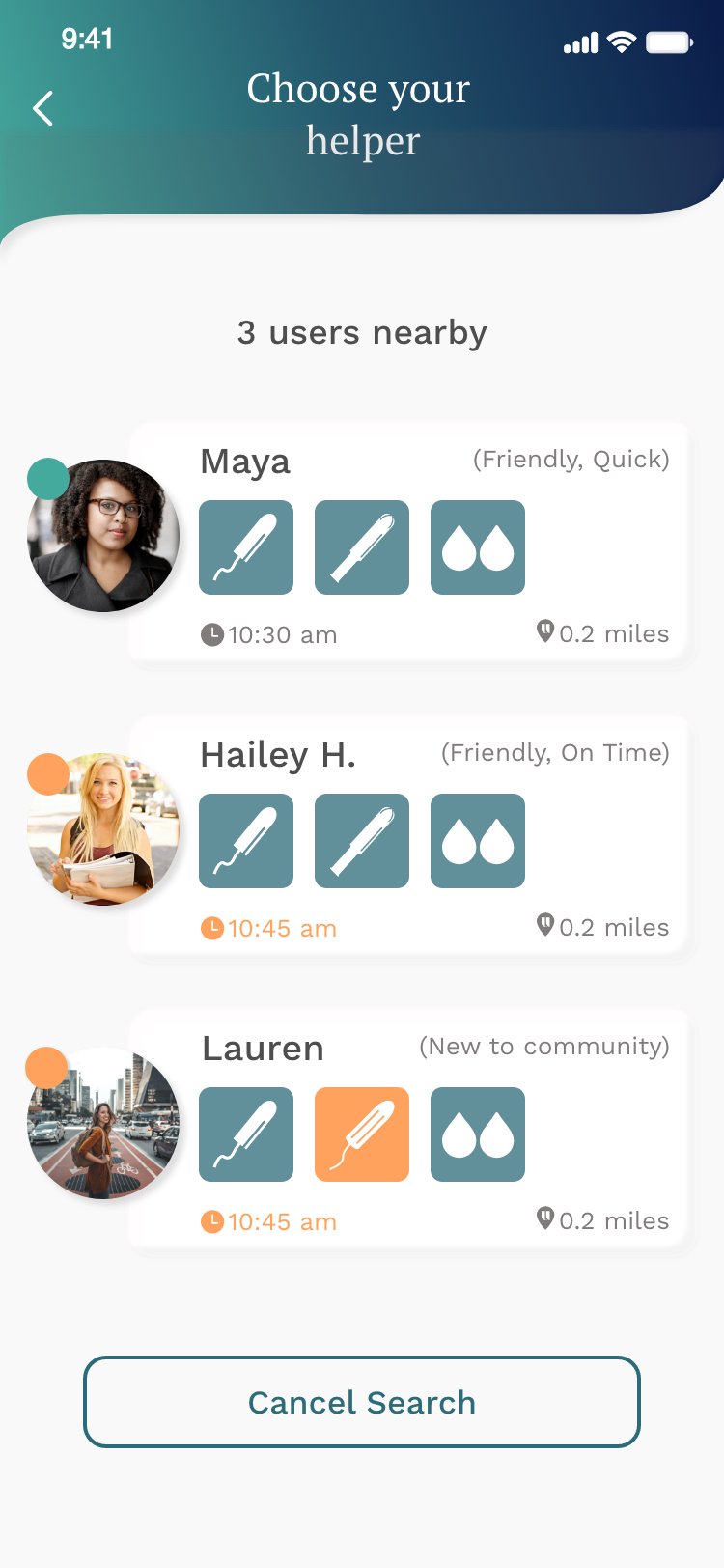
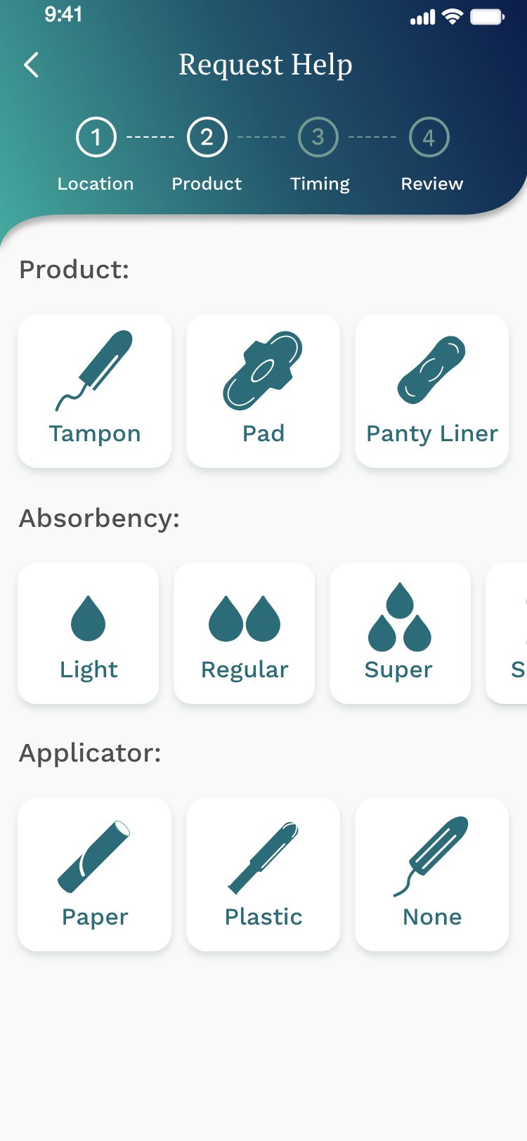
Product selection options
Users need more direction as to what they need to accomplish, more product options and more images
Key Takeaways:
5 users commented or suggested to improve inclusivity by adding more products
4 users mentioned the colors seem old and boring
All 6 users suggested adjusting the colors to increase legibility and better align with company brand.

Our Solution
Mimic the market with fun and recognizable images
Because there are a variety of products available, it was important to include options such as: absorbency and applicator type a suggestion I made being an individual with a menstrual cycle.
Pain Point
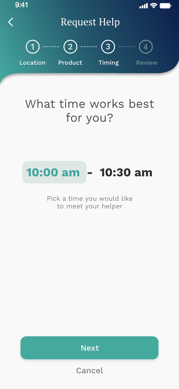
Time selection options
Feedback from users suggested an easier and faster way to select time with buttons. The current page gave too many options for the user, and seemed busy and overwhelming. Moreover, accessibility issues became a main concern as the current brand colors made it difficult to read and understand text.

Key Takeaways:
4 users suggested this page should be fast and quick. Select only one option to pick a time.
3 users stated the instructions were confusing and made it difficult to read and understand what they needed to do
Our Solution
Keep it native and simple
After discussing with engineers, it was best to use a native feature to select time since we were primarily designing for IOS mobile. This implementation would be familiar to users, therefore improve usability, resulting in faster task completion this page.
In addition, we did our best to simply the text and added a CTA (Call-to-Action) button so users know how to move to the last step.

Pain Point
Brand disconnect
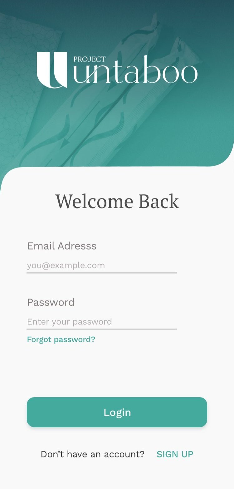
Two users mentioned that when used together, the colors and fonts gave a vintage almost old fashion feel - not the look and feel the company was going for.

Our Solution
Talk to the Founder and CEO to get an idea of how she would like the app to feel in people’s hands.
I realized that maybe the colors didn't need a change. I omitted some of the colors and adjusted the tone of others. With the new colors I created a moodboard to help guide our design direction and keep us on track.

User Testing and Analysis


Because we worked in two week sprints, we were constantly conducting user test and analysis, utilizing many different UX methodologies throughout our iterative process.
Ideation
6-8-5 Workshop
Much of the work done was for existing screens. However, the current user flow had no home screen. I decided to take this upon myself to create and design.
I enjoy workshops for brainstorming and I was excited to lead the first one with our design team and Project Untaboo's team of engineers, and Founder and CEO.


What we learned:
It was important for users to search for products and help. they need directly from the home screen
Display a period tracker
Have an option to offer help to those in need
Keep design simple and straight forward
Designing the home screen
Using the mood board I had created, and the workshops ideas, I decided to chose idea with the most common functions found during our workshop to test with users.
Pain Points uncovered through testing
1. Period Tracker or Period Product Finder?
Because the period tracker was front and center, users questioned whether the app was intended to be a period tracker. It wasn't, so that was an immediate red flag.
2. Heavy usage of single colors
Users were initially overwhelmed by the heavy use of the teal color and quickly got annoyed at the lack of contrast.
3. The primary function was lost
To add to #2, the primary buttons were a similar color to their respective backgrounds, making it much more difficult to notice when in entering the home screen.
Reflection
Embracing the feedback
In a way, it was good to test the initial design from the workshop. I found this was a way to prove or disprove some of the ideas that were presented and discussed with the team. This feedback could also be used for future reference as well with additional screens future teams wanted to create and design.
What we learned:
There was poor informational hierarchy
Heavy use of a single color was overwhelming
Inclusivity was very important
Home screen
Using the mood board I had created, and the workshops ideas, we decided to chose the screen that capsulated the most common functions found during our workshop to test with users.
My Solutions

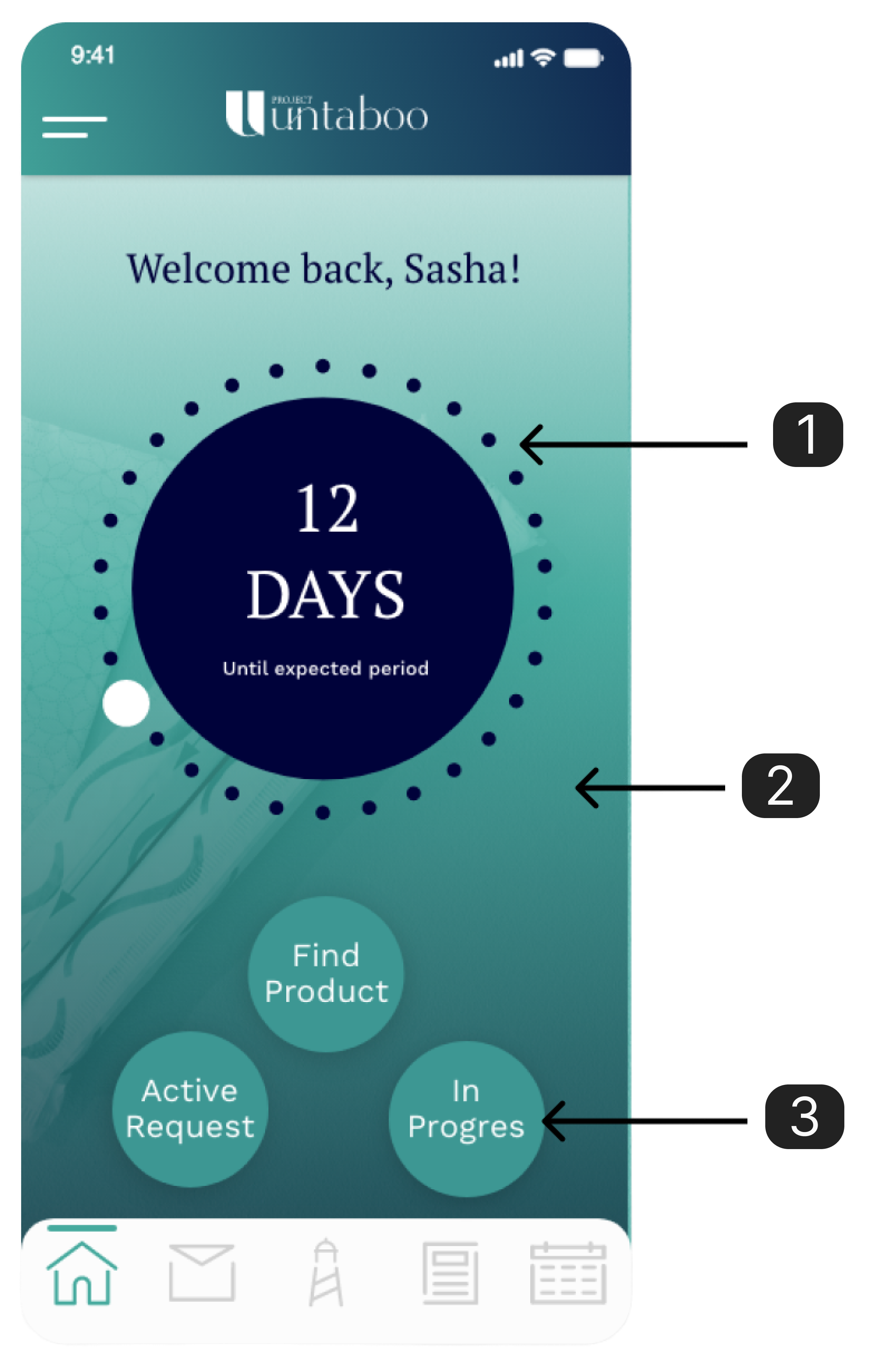
1. Present the primary functions first
The simplest fix was switching the order of the primary buttons to find products and the period tracker, as well as minimizing the period tracker - great!
2. Use brand colors judiciously
To give this app a clean, upscale feel I had to utilize less of the primary brand colors. This would also let the content breathe and not overwhelm users.
3. Add primary & secondary CTA (Call-to-action) buttons
Previous feedback showed that the buttons got lost behind such similar background, and although no one really mentioned it, there was no hierarchy in any of the buttons. Too many options and no hierarchy was an issue I had to simplify by adding a primary and secondary button and minimize options.
User
Insights
Our research opened our eyes to smaller but more impactful issues users wanted to avoid, issues beyond needing period products.
People wanted:
An app that was straight forward and to the point, no extra fuss or added stress
A personable experience so they feel taken care of
A social experience that made them feel safe
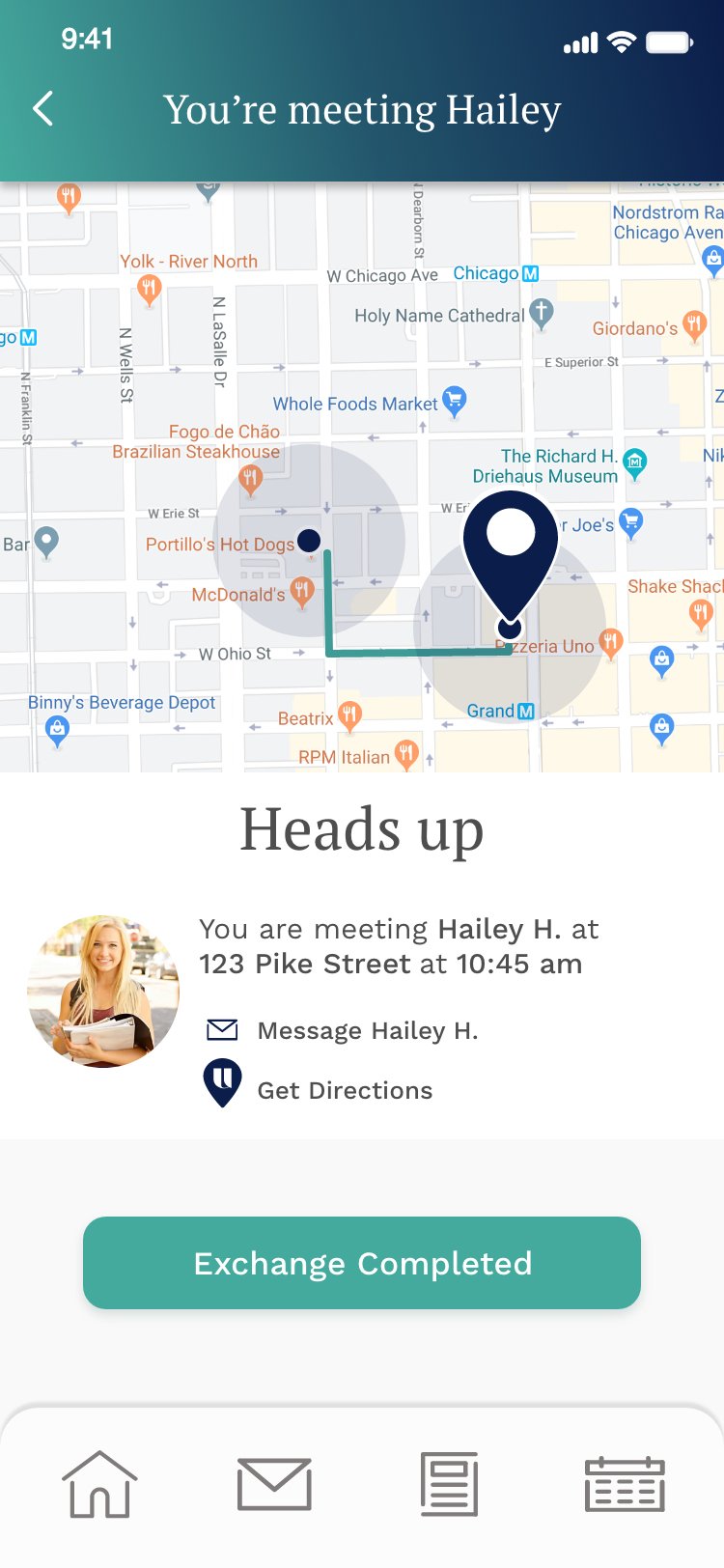
Final Screens
Learnings
Test early and often
Testing is an art and should be done strategically to get unbiased feedback. You learn so much early in the process and it pays off with great user insights. Every user brings something new to share.
Collaborate with engineers
Collaborating with engineers early in the design process ensures that product designers create feasible, innovative solutions that align with technical capabilities and constraints. This synergy accelerates the development cycle, enhances product functionality, and leads to a more seamless user experience.
Small details matter
Paying attention to small details in a larger project, especially when building an MVP (Minimum Viable Product), is beneficial because it helps to identify and prioritize the core functionalities that deliver the most value to users.