Improving consistency and cohesion
Tagboard’s Style Guide

Started
2021
Product Designer
Role
Company
Tagboard
Background
As the lead designer at Tagboard, I orchestrated the direction of many projects. Upon starting my role, I found the Style Guide was rather small and lacking many design assets.
Note: There was no ‘official’ Design System (DS) in place, work was loosely following Bootstrap.
My goal was to make this the stepping stone for an internal DS, a huge movement I took upon myself to start.
Scope and Considerations
I took initiative and this became my first official project. Built under legacy code, Tagboard had an extensive suite of features under two separate products.
Tagboard Dashboard (a light mode product)
Producer (a dark mode product)
After discussing with the CPO, it was clear that this approach had to be delicate and strategic.
My approach for a 2 month timeline:
Get buy-in from engineers
This ensures that coding practices are consistent across teams.
Leading to higher code quality and simpler maintenance.
Promoting adherence to the guide and easing the onboarding of new team members.
Audit our product - Tagboard Dashboard
Auditing our product is essential to gain buy-in:
Provides a clear understanding of current practices, identifying inconsistencies and areas for improvement.
Highlighting how it negatively impacts user experience and complicates code development and maintenance
Prioritize Smaller Components
Once I had buy-in, it was time to put our heads together and decide what components to tackle first.
A single component
A group of related components
Components by theme
An entire library?!
Baking Accessibility into the aduit
The Web Content Accessibility Guidelines (WCAG)
The Web Content Accessibility Guidelines (WCAG) are globally recognized standards that outline methods for making digital content more accessible to individuals with disabilities.
A rating system A, AA, and AAA are used to indicate compliance to WCAG. A being the minimum rating, and AAA being the max a.k.a an excellent rating.

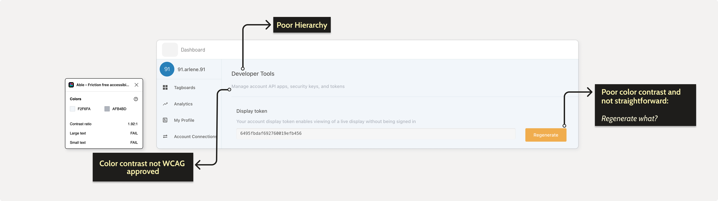
Auditing Tagboard Dashboard
This gave me the opportunity to focus on accessibility, something that the dashboard was greatly lacking and can be improved upon.
I focused highly on:
Evaluating color contrast against various backgrounds meet the Web Content Accessibility Guideline (WCAG) standards
Guaranteeing that font sizes and touch targets are WCAG approved
Maintaining uniformity across layouts and akin user interface components.
Layout responsiveness
Hover and Focus states fro Call-to-Action (CTA’s) button
Forms (errors, labels, etc.)
A team effort
Once I completed my audit, I set up a presentation for the Product and Engineer teams to share my findings.
Here I am showing just the Primary CTA.


Component
Primary Button
WCAG Guideline
1.4.3 Contrast (minimum) Level AA
Description
WCAG 2.1 level AA requires a contrast ratio of at least 4.5:1 for normal
User Impact
Serious
Laying down the foundations
After a few strategic discussion, my first 3 things to tackle were:
Color contrast, specifically in CTA’s (call-to-action) buttons
Typography and hierarchy
Different states for input fields and CTA’s
A look at the “Before” of the dashboard
Components and guidelines
I began by establishing the groundwork with a collection of page templates. Adhering to the best practices in dashboard UX, I investigated various strategies for hierarchy in both typography and all UI elements, spacing, and color contrast.

A few examples of my approach to establish guidelines for padding, breakpoints, CTA’s, and typography.
Next:
More than just a single component.
The following steps now required me to create components, their related components and the components grouped in their themes, found across the UI. Using Using Atomic Design Approach as an inspiration.
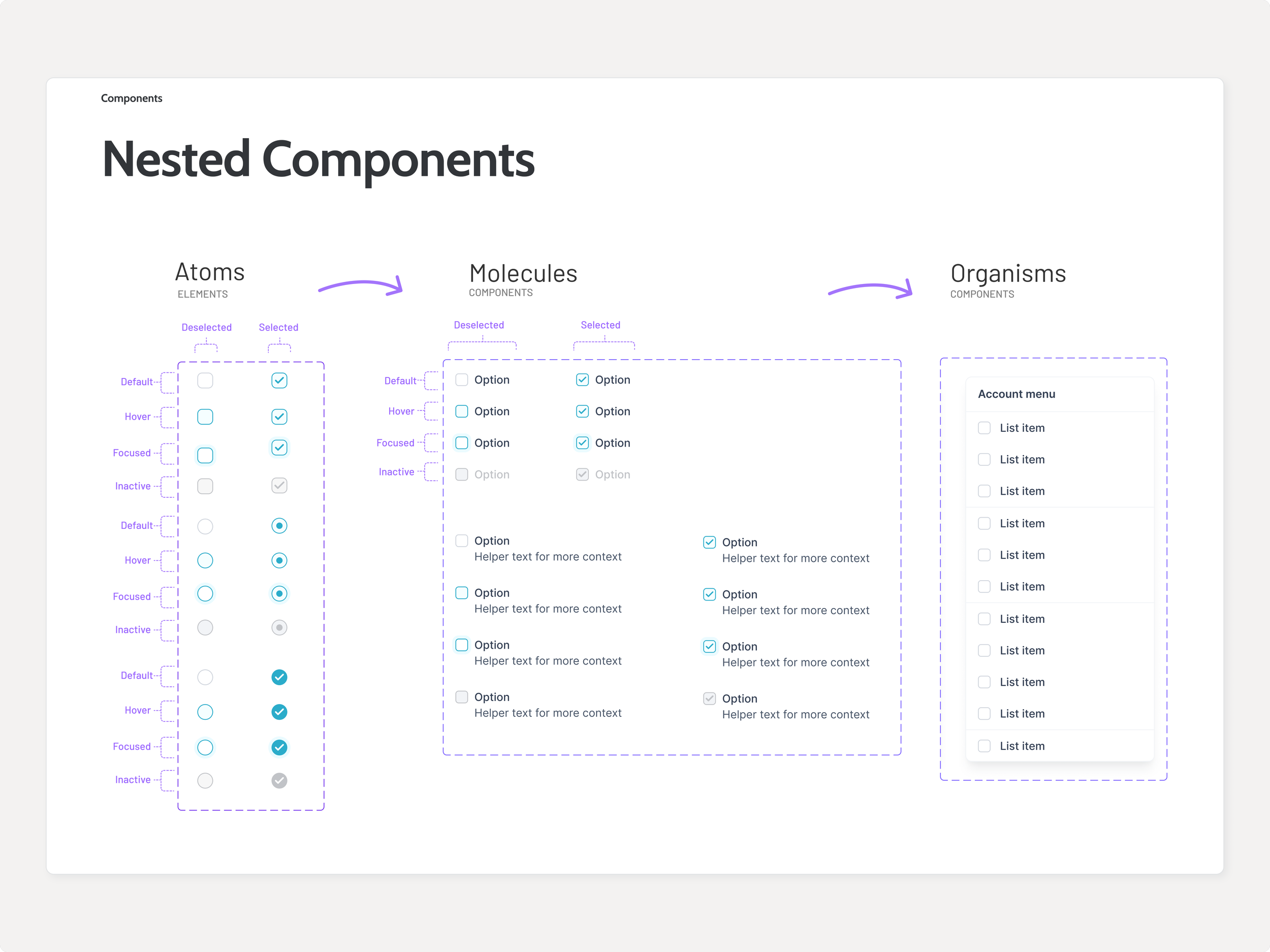
Nested component example
Cross-Collaboration is key
It was imperative to have a close alignment with the engineers. Having a naming convention that is consistent in the Style Guide, and future Design System, with code is important to further scale the system in place and increasing development speed.

Example of a naming convention we created for the Primary CTA Buttons

Button Components and its variants with proper naming
Before and After

Before

After + A new ✨ Style Guide ✨
Design Impact
Over time I got to see and feel the fruits of my labor; my workflow became dramatically efficient. Dragon Drop, anyone?
But most importantly, we saw:
Cleaner, more consistent code, which is easier to understand and maintain.
Reduction in of errors and decreased time and effort required for debugging and updating code.
A streamlined development process, accelerating project timelines, and enhanced overall productivity.
Reflection
Because the product was working off of legacy code, new implementations of components would be laborious, not to mention the code itself needed an accessibility improvement.
It would be years before the team would do a code rewrite and be ready for a ✨ design system ✨.
With only 1 designer and not enough engineering resources to build and maintain a design system from scratch, we decided to move forward with an open-source design system.
This new design system would be one I would help maintain and expand into something magical my original Style Guide could have been 💛.